
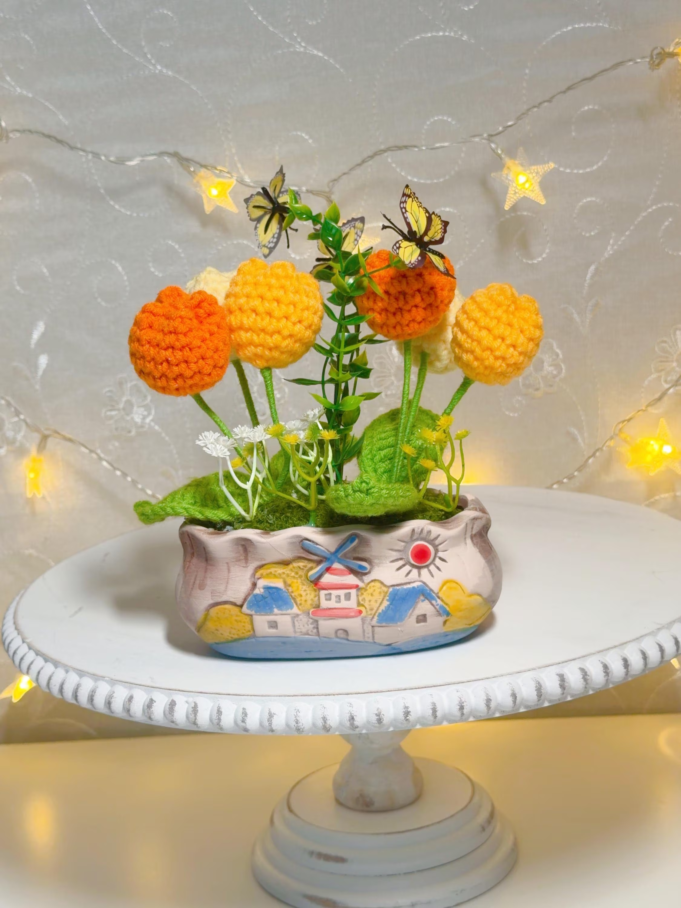
Color is one of the fastest ways to bring calm and clarity to a crowded countertop. For a small shop like Helium South Beach that carries compact handmade crochet goods and other delicate accessories, deliberate color decisions reduce visual clutter, speed customer choices, and make restocking predictable. This article gives practical, trade-off–aware methods to group by hue, use contrast, and set replenishment rules that fit a small footprint.
Simple color blocks to anchor a small table
Start with three to five color blocks rather than a rainbow across the whole surface. Pick a dominant neutral (ivory, sand, charcoal), a primary accent, and one or two seasonal or limited hues. Each block becomes a mini-display for related crochet accessories so shoppers immediately understand where to look.
Trade-offs: large blocks read as tidy but limit variety in a very small display. If you need to show a broad palette, compress each color to a single stacked tray or bowl rather than scattering items. That keeps visual weight balanced and avoids the “everything everywhere” impression.
Use contrast to make items pop
Contrast is about background and pairing. If your crochet pieces are mostly pastel, place a charcoal or warm wood surface behind one group to give shapes definition. For darker handknits, use a light linen runner or painted riser so texture and stitch patterns come through without introducing new colors.
A practical decision point is how many contrast zones to maintain. In a single 2x3-foot table, two contrast zones are enough: one for lighter tones and one for darker tones. More zones create visual interest but increase the amount of splitting and signage needed to keep the display coherent.
Merchandise small handmade accessories by color
To merchandise small handmade accessories by color effectively, group items that share a dominant hue and vary by shape or function within that group. For example, on a crochet-focused shelf, place scrunchies, coin pouches, and small amigurumi of the same color in one horizontal band so customers see related options at a glance.
Keep an eye on cross-merchandising opportunities inside each color band: contrasting trim, buttons, or a different stitch can encourage add-on purchases. If you sell items with small-parts cautions or special care instructions, keep those items clearly labeled within their color group and defer to each listing for precise details.
Replenishment rules for compact displays
Simple replenishment rules keep a small display looking full without overstocking. Use a one-for-one rule for fast movers (replace an item immediately from the backstock) and a threshold rule for slower sellers (restock when a color band falls below three pieces). Write these rules on a restock card so anyone on shift follows the same approach.
Consider the trade-off between visual fullness and inventory exposure. Always maintain a tidy backstock nearby so you can refresh a color band quickly, but avoid unloading large quantities onto the table where the display reads cluttered. Consistent rules save time and maintain the display’s intended visual rhythm.
Mixing textures without breaking the color story
Texture adds depth and prevents a flat block of color from looking monotonous. Pair chunky crochet stitches with smoother cotton pieces in the same hue, or add a small wooden tray to introduce a natural element that unifies multiple colors. Keep texture changes intentional and limited to one or two elements per color block.
The decision to mix textures depends on the scale of items. On a compact surface, too many textures compete; on a shelf with vertical space, layered textures can create a more curated look. Use texture to guide the eye—ribbed or looped pieces at eye level, flatter items below—so shoppers can feel the variety without losing the color cue.
Signage and color-focused selling cues
Small, color-coded signage helps customers understand grouping quickly. Use simple cards that match or contrast each color band and include brief cues such as material or care shorthand (but refer customers to the listing for detailed care instructions). Avoid dense copy; a single phrase plus price area is usually enough for compact displays.
Decide how literal your color cues should be. A literal approach uses the exact fabric swatch or a painted block to identify the band, while an interpretive approach uses a coordinating tone to signal a family of colors. Literal cues reduce confusion; interpretive cues offer more visual flexibility when inventory shifts.
Color-first merchandising keeps small handmade crochet displays clear, flexible, and easy to maintain. Start with a few color blocks, add contrast, set simple replenishment rules, and use texture and signage sparingly to support the story. For hands-on advice or to see examples in person, visit Helium South Beach at 760 Ocean Drive Store No. 6, Miami Beach, FL 33139, email [email protected], or call +1 305-538-4526. Follow @helium_southbeach on Instagram for current displays.