
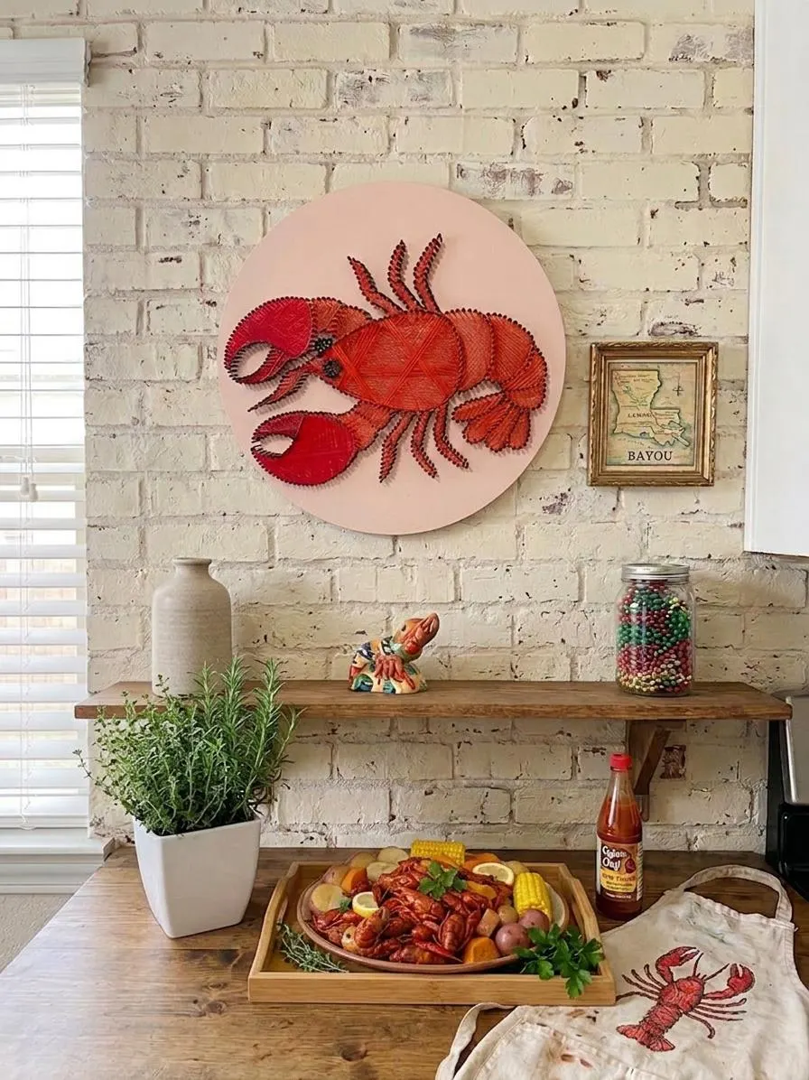
Neutral rooms offer a calm backdrop that invites tactile and visual contrast. When you pair textured handmade art with neutral rooms, you create intentional focal points that read as thoughtful, layered design rather than accidental clutter. This guide focuses on color contrast, scale, material choices, and placement strategies specifically for wall hangings and similar textured pieces.
How to pair textured handmade art with neutral rooms
Start by identifying the dominant undertone of your room’s neutrals—warm (beiges, creams), cool (greys, tans with blue undertones), or true white. That undertone will determine whether you want your textured piece to harmonize (choose materials and fibers that echo the undertone) or to pop (introduce a contrasting warmth or coolness). A woven piece in warm wool will read differently next to sage-grey walls than a cotton macramé would.
Think about contrast not only in color but in intensity. High-contrast pieces—think deep indigo fringe or a charcoal felt relief—read as anchors against pale walls, while softer, low-contrast textures add depth without stealing the room’s calm. Deciding which approach to take depends on whether you want the art to be the focal point, or simply another layer in a quiet, tactile scheme.
Use color contrast to make texture sing
Color contrast helps the eye register texture more clearly. A neutral room with beige walls will make a cream-colored, sculptural wall hanging read as subtle and textural; that same piece against a darker backdrop becomes a study in line and shadow. When selecting yarns, fibers or mixed-media wall art, ask yourself whether the piece should command attention or quietly complement the rest of the room.
If you want drama, choose a single saturated accent color within a textured piece and place it where the lines of the room converge: above a mantel, behind a headboard, or in an entryway. For a quieter result, pick art with tonal variation—layers of off-white, cream and soft grey—that reveal themselves as you move through the space.
Balance scale and placement in neutral spaces
Scale is a practical decision as much as an aesthetic one. A large textured wall hanging can anchor a long sofa or an empty expanse of wall in a minimalist room, while a small, highly detailed piece might get visually lost. Measure and mock up placement with craft paper or painter’s tape before committing to nails; seeing the silhouette in situ makes the scale trade-off obvious.
Placement also influences how texture reads. Hang textured art at eye level for maximum tactile impact; higher placement can turn a statement piece into a background accent. Consider grouping smaller textured works into a cohesive arrangement to create a single, larger focal area without overwhelming the room’s neutral calm.
Choose materials for tactile variety
Different materials convey different tactile stories: wool and boucle feel warm and sculptural, linen and cotton read softer and airier, and mixed media pieces with wood or metal elements add structural contrast. When curating textured wall hangings, mix a couple of material families to keep the room interesting while maintaining a neutral palette.
A practical trade-off here is maintenance versus look. Some fibers attract dust more visibly or require specific care; others are more forgiving. Always check the individual listing for care instructions rather than assuming one material behaves like another, and plan placement where occasional maintenance is feasible without disrupting the room.
Anchor with a focal piece and support it with accents
Choose one stronger textured piece to serve as the anchor—this could be a woven tapestry, a layered fiber panel, or a dimensional paper relief. That anchor sets the tone for the room’s tactile language. Surround it with supporting elements in similar or complementary tones such as matte ceramics, soft throws, or a sculptural lamp to create a cohesive grouping.
When you use multiple textured elements, maintain a consistent rhythm: repeat a color, a small motif, or a material to tie everything together. This prevents the space from feeling disjointed and ensures your neutral background continues to read as calm rather than chaotic.
Layering and mixing finishes in neutral palettes
Layering is where texture becomes immersive. Combine a textured wall hanging with varied surface finishes—matte paints, raw wood frames, or linen upholstery—to encourage the eye to travel. In neutrals, subtle differences in sheen and depth make a big difference; a matte woven piece against a slightly reflective plaster wall will create gentle highlights and shadows that enhance perceived texture.
Be mindful of competing details. If a room already has patterned rugs or heavily veined stone, choose simpler textured art to avoid visual overload. Conversely, a minimalist room can handle more elaborate handcrafted wall hangings. These trade-offs determine whether your textured pieces serve as punctuation marks or continuous conversation throughout the space.
Neutral rooms are invitations to explore texture without competing color. By considering undertone, color contrast, scale, material, and placement—and by checking individual listing care details—you can use wall hangings and textured handmade art to create spaces that feel layered, intentional, and balanced. For help selecting pieces or to view wall hangings in person, stop by Helium South Beach at 760 Ocean Drive Store No. 6, Miami Beach, FL 33139, email [email protected], or call +1 305-538-4526.