
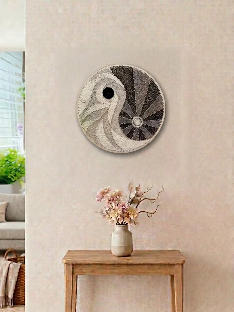
When you arrange colorful wall art in gift shops, thoughtful grouping turns scattered pieces into a coherent display that helps customers browse and buy. This plan focuses on palette, design relationships and viewing height so small retail footprints can present wall hangings with impact and flexibility without overbuilding fixtures.
Start with a palette and store sightlines
Begin by pulling wall hangings into rough color families: warm (reds, oranges, golds), cool (blues, greens), neutrals and mixed palettes. Lay pieces on a table or tag them in inventory so you can visualize combinations before committing to the wall. In a tight space, limiting each wall face to two related palettes reduces visual noise and helps customers find the mood they want.
Account for sightlines from the entrance and main aisle. A high-contrast arrangement will grab attention when seen across the shop, so reserve one bold pallet for your feature wall and use softer families on adjacent walls. The trade-off: an all-bold front will attract, but too many competing bold walls can make the floor feel chaotic.
How to arrange colorful wall art in gift shops
Group pieces by how they read at arm’s length versus across the room. Small, delicate wall hangings work well in clusters near counters or shelving where customers can get close; large graphic pieces should occupy primary sightlines. When you arrange colorful wall art in gift shops, think in layers—feature, companion, and filler pieces—to control where the eye rests.
Make deliberate decisions about contrast and rest space. A single large, saturated piece surrounded by light-toned companions creates a clear focal point. Conversely, a tight grid of similarly sized colorful pieces reads as a composed set; the trade-off is less opportunity to highlight individual makers, but more visual cohesion for shoppers scanning quickly.
Group by design, scale and material
Beyond color, group by motif and construction: woven pieces together, framed prints together, and mixed-media works in their own cluster. Grouping by material helps customers compare texture and finish without moving across the entire store. In a small shop, this saves floor space and creates mini-collections that read as intentional.
Consider scale relationships: pair small, highly detailed pieces with mid-sized quiet pieces rather than with giants that dwarf them. When display space is limited, modular groupings (two or three sizes repeating) create rhythm and make inventory easier to swap. The trade-off here is flexibility versus emphasis—homogeneous material groupings are flexible but can hide standout pieces.
Set viewing heights and focal zones
Establish consistent viewing heights so the eye doesn’t jump around. Choose a center line for most pieces—many retailers use roughly mid-chest height for the average customer—and place the most important pieces on that line. For mixed sizes, align centers or bottoms to create a stronger horizontal flow in narrow aisles.
Create focal zones for featured makers or seasonal themes. A dedicated zone near the entrance or checkout gives you a place to highlight rotating wall hangings. The trade-off is that dedicating prime real estate to rotation reduces space for permanent collections, so plan rotations that complement existing palettes to avoid visual whiplash.
Spacing, frames and trade-offs
Use consistent spacing between pieces in a cluster to make groups feel curated. For small groupings, tighter spacing emphasizes unity; for larger, bolder pieces, give more breathing room. If you use frames, keep frame tones limited across a wall so frames act as a supporting element rather than competing with artwork.
Decide whether to mix frame styles intentionally or to standardize. Mixed frames add eclectic charm but can dilute a curated look; standardized frames streamline the visual field but may flatten diverse work. In a small store, simplicity often wins: a restrained approach makes merchandise easier to shop and rotate.
Lighting, labels and practical rotation
Adjust lighting to highlight textures and colors without creating glare. Track heads or directional fixtures aimed at wall hangings bring out fiber and paint detail, while even ambient light prevents hotspots. Test displays at different times of day since natural light in small shops changes the perceived palette.
Label placement should be consistent and legible without crowding the artwork. Use small, uniform cards or tags that include maker and price where appropriate. For rotation, build modular hang points so you can swap pieces quickly; flexibility reduces downtime and keeps displays feeling fresh while you balance featured and evergreen wall hangings.
A practical display plan groups wall hangings by palette, design and viewing height while accepting a few trade-offs: dedicated focal walls vs. broad variety, mixed frames vs. uniformity, and tight clusters vs. open breathing room. For help choosing groupings from our Wall Hangings selection at Helium South Beach, stop by 760 Ocean Drive Store No. 6, Miami Beach, FL 33139, email [email protected] or call +1 305-538-4526. Follow visuals on Instagram at https://www.instagram.com/helium_southbeach/?hl=en.