
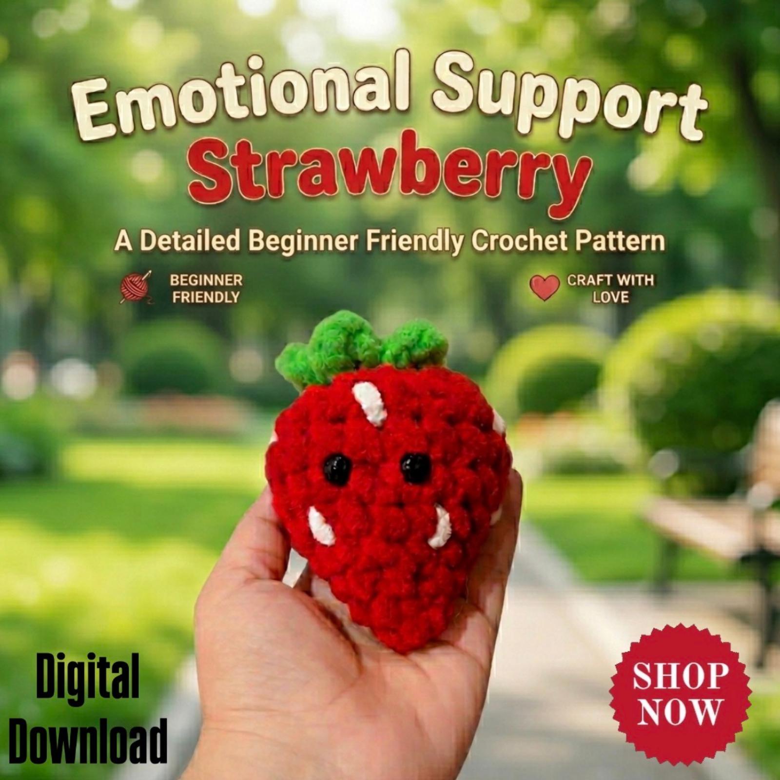
A mindful color story changes how a customer sees a display. Instead of arranging items by size or type, grouping them around a limited, intentional palette turns disparate handmade pieces into a curated collection. This guide walks through a repeatable, approachable process you can use on a table, shelf, or browser page.
Pick one anchor color to start
Begin by selecting a single anchor color that represents the mood you want to convey. That anchor can be bright and cheerful, muted and natural, or jewel-toned; the point is to give the eye a starting place so other items read as choices rather than clutter.
Trade-offs matter: a bold anchor demands higher contrast companions to avoid visual muddiness, while a soft anchor benefits from richer textures to keep the display from looking flat. Choose based on the feel you want—energy or calm—and be prepared to swap the anchor if the resulting mix doesn’t read the way you intended.
Gather tactile and tonal companions
Collect items that echo the anchor in either tone or texture. If your anchor is a deep navy, look for lighter blues, warm neutrals, and tactile materials like crochet, woven fibers, or matte ceramic to create layers that connect visually without matching exactly.
Consider undertones—warm vs. cool—and decide which side you’ll favor. Mixing undertones can work if you add a neutral bridge like natural linen or kraft paper, but mixing them without a bridge risks a disjointed look. Test combinations on a small tray before committing to the full display.
Arrange for scale, repetition, and rhythm
Use repeat elements to build rhythm: three similar-size objects in varying shades, a scattered group of small accessories, or a pair of larger pieces anchoring opposite sides. Repetition creates cohesion across varied handmade items and helps the eye move through the display.
Scale choices create focus. A single larger piece can serve as a focal point, while clusters of small items provide texture and discovery. Be mindful of sightlines from different viewing heights—what reads as balanced at counter height might feel top-heavy when seen from a standing customer’s perspective.
Edit for contrast, breathing room, and clarity
Step back and remove anything that competes with your anchor or makes the palette muddy. Negative space—small gaps, neutral backdrops, and single-item pedestals—lets color choices speak. Editing down improves clarity and helps shoppers quickly understand the display’s story.
Decide whether contrast or harmony serves your intent. High-contrast pairings draw attention quickly but can feel busy; harmonious mixes are calm but risk blending together. Use a few contrasting pops or metallics if you need to increase visual interest without overwhelming the overall palette.
Labeling and signage that reinforce the palette
Simple signs, price tags, and handwritten notes should echo your color story rather than conflict with it. Choose tag paper, marker colors, or backing cards that live within your palette so those functional elements support the display instead of undermining it.
When you change a display, update small collateral first to test color cohesion. Swapping ribbon, twine, or backing paper is a low-effort way to strengthen a story and see how minor tweaks affect overall perception before redoing the entire arrangement.
color stories for handmade gift displays
A practical, repeatable plan begins with anchor selection, then adds tonal companions, scale adjustments, and editing. For example: choose coral as the anchor, add blush and warm beige companions in soft-textured materials, repeat elements in odd numbers, and leave neutral gaps to let pieces breathe.
Apply this approach to mixed inventory across Amigurumi, Crochet, Wall Hangings, and Craft Supplies & Tools by focusing on connecting qualities—color, texture, or material—rather than matching items by category. That produces approachable displays that invite touch and browsing without feeling forced.
Color-led displays are not about strict rules but a sequence: anchor, gather, arrange, edit, and refine with supportive signage. Treat every refresh as an iteration—small swaps in tonal companions or scale often yield big changes in readability. If you’d like hands-on advice applying these steps, Helium South Beach welcomes questions at [email protected] or by phone at +1 305-538-4526; our store is at 760 Ocean Drive Store No. 6, Miami Beach.