
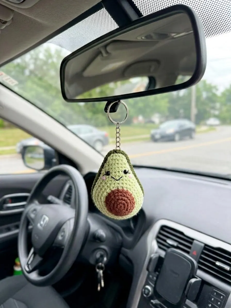
A crowded checkout can turn a last-minute sale into a missed chance. For small retailers like Helium South Beach, a tidy, intentional approach to displaying small accessories makes those extra purchases more likely while keeping the counter functional for staff. Below are concrete layout, labeling, and access choices that respect a small footprint and real daily workflows.
How to display small gifts beside a retail checkout
Start by defining a single, dedicated zone for impulse items rather than scattering merchandise across the whole counter. A defined zone — a shallow tray, a low riser, or a slim vertical panel behind the register — helps customers scan quickly and prevents the sales surface from becoming a catchall for deliveries, receipts, or wallets. The key is an obvious edge between transaction space and browsing space.
Balance visibility with restraint. Too many different items competing for attention will reduce each item’s impact. Aim for a cohesive assortment in the zone: a few types of small accessories drawn from categories such as Amigurumi, small craft tools, or compact wall-hanging accents. Rotate the assortment regularly so repeat customers see new combinations without the area becoming visually cluttered.
Keep the counter usable for transactions
Reserve clear space for the essential transaction tasks: customer payments, bagging, and quick product checks. Place any display pieces off to one side or slightly behind the primary register plane so staff can set down items quickly without moving displays. If your register area is narrow, consider a narrow ledge-mounted display that leaves the register plate free.
Make it easy for staff to reclaim the space when needed. Use lightweight trays or modular display units that can be lifted and moved in seconds. Staff should be able to hand a customer a packaged sale while still accessing receipts and the card reader without displacing merchandise.
Use clear labeling and simple signage
Clear labeling reduces friction at checkout and encourages impulse purchases. Price tags should be readable at arm’s length and placed consistently so customers can check prices without asking. Small, uniform tags or a single compact price strip per tray keep the area tidy and make switching stock easier for staff.
Add one short benefit line when helpful, such as “perfect desk companions” or “handmade accent,” but keep language factual and minimal. Avoid long descriptions; the checkout display is for quick decisions. If an item has special care or small-parts cautions listed in its product page, keep those details in the individual listing rather than on the tiny checkout label.
Design for quick access and secure placement
Decide whether you want items fully reachable or behind a low barrier. Open access encourages touching and faster conversion but increases the chance of accidental displacement. Small baskets or shallow bins let customers pick up items with confidence; clear acrylic risers or secure hooks keep items visible and controlled if your space sees a lot of traffic.
For fragile or very small items, consider using a locked display or staff-access drawer and encourage staff to offer the item during the transaction. That preserves visibility while reducing handling and keeps the counter clean. Weigh this against the friction added to the purchase — locked displays can deter some impulse buys, so use them selectively.
Train staff on rotation and maintenance
A tidy-looking checkout depends on daily upkeep. Build a quick checklist into shift routines: straighten tags, return stray pieces, and swap out items that have sat unchanged for more than a few days. Quick three-to-five-minute refreshes keep the zone attractive and prevent buildup of unsold, outdated pieces.
Empower staff to suggest items from the display to customers naturally during checkout. A simple line like, “Would you like to add this?” works better when the display has been curated and labeled. Staff should also know where overflow stock is stored so they can replenish without rummaging through the register area.
Measure results and iterate display choices
Test different assortments, positioning, and access styles and track which combinations convert best. Keep adjustments small and deliberate: change one variable at a time, like swapping a riser for a tray or replacing an assortment with a single product type. Use sales data and staff feedback to guide decisions rather than impressions alone.
Accept trade-offs: a highly visible open display may convert better but require more maintenance, while a low-touch secure display reduces handling but may lower impulse buys. Finding the right balance for your store layout, foot traffic, and staffing levels is a practical process of small experiments rather than a single perfect solution.
A tidy checkout-area approach makes it easier to display small gifts beside a retail checkout without sacrificing the counter’s primary function. Define a dedicated zone, use clear labels, design for quick access, and keep a short staff routine for upkeep. If you’re in Miami Beach, stop by Helium South Beach at 760 Ocean Drive Store No. 6 to see examples in person or email [email protected] for a quick question. Follow @helium_southbeach on Instagram for visual ideas you can adapt to your own register.